Easy Tips for Choosing Your Exterior Paint Palette
1. Plan around the elements that are hardest to change.
Surfaces such as roof shingles or tiles, stonework, pathways and driveways will remain in place unless you are doing a complete renovation.
Look for undertones between the colours that might form your exterior colour palette and see if they are a warm tone (beige, khaki, brown and rust) or cool tone (grey, blue and black). Go for the colours that will go with the undertone in a harmonious way.
2. Consider your home’s architectural style and era.
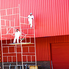
There are several paint manufacturers that offer collections of historically accurate colours, which are an excellent springboard for your palette. You can also consult a professional designer who specialises in this area. You are not bound to adhere strictly to historical guidelines unless codes for your home and neighbourhood specify otherwise, but for the most pleasing effect, it is advisable to not stray too far from them. This is applicable for Commercial and Industrial Painting as well.
3. Think about the visual effect you want.
You might choose a slightly lighter or brighter colour so that it stands out from a cluster of large, towering trees or to the street and surrounding landscape.
4. Never rely on paint chips alone.
Exterior shades can vary significantly from the way they appear on the chip. To save you from an awkwardly painted exterior buy a quart of paint and test it on an inconspicuous area of your home. Examine it at different times of day and under different weather conditions, if possible.
5. Choose 3 or more different paint shades.
An exterior scheme has three major parts essentially:
a) Field colour that dominates
b) Accent colour that brings doors, shutters and other smaller areas to life
c) Trim colour which is used for windows and door casings, roof edging, railings and other trim work.
Though ideally, the trim colour should contrast with the field colour. If you are going for a dark main hue then consider classic white trim or another pale shade.
Similarly, a light field colour looks stunning with a darker trim. Just like how your eyeliner produces a crisp and dramatic effect. You are free to go bold with accent colours but obviously, do not overboard it. A door painted bright blue or lemon green can add just the right hit of punch but if you extend the same shade to the shutters and gables … it will look crap.
If you are still confused and looking for inspiration then Pro painters Sydney offers preselected colour palettes that eliminate the guesswork out of coordinating an exterior scheme. Our professional architect or a colour consultant can help you come up with a combination according to your desires that’s unusual but still attractive.